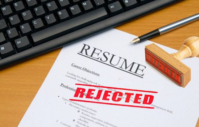

Run spell check and grammar check on your resume before submitting it. Have someone else review it in case you’ve duplicated a bullet or made a mistake grammar checkers won’t recognize. These are tips we have all heard before. That’s why the mistakes count so much against you when you make them. However, the obvious mistakes aren’t the worst ones you could make. The worst mistakes you may make on your resume are the ones you don’t realize are a mistake.
You Used a Creative Template
Creativity can get in the way of getting your resume past the gatekeepers. Resumes on pink, perfumed paper, for example, might get ditched by a secretary who thinks it is an inappropriate act of sexual harassment. Sending your resume on a cake could result in it tossed in the trash, while a resume printed on a T-shirt is unlikely to be read unless they’re literally following you home.
Suppose you’re sending a digital resume. Keep the cute colors and interactive graphics out of your submission. If the document tries to load interactive graphics or pull content from an external source, their virus protection may quarantine and delete your resume before it ever reaches a human being. Including watermarks and photos can hurt you, too. A photo opens the door to being discriminated against based on how you look. It may not be racism or sexism. It may be because they don’t like your haircut, the T-shirt you wore in the photo seems unprofessional, or the included picture threw off the formatting of the resume itself. Or the attached file makes them suspicious enough not to open it in the first place. Watermarks built into the document hurt you, too. They may hurt the readability of the text, and that’s a strike against you.
You Choose the Wrong Font
There are smaller choices we make thinking they’re cute when they actually hurt you. For example, creative fonts interfere in the readability of your resume. When it loads on a computer or within a browser window that can’t process it, your resume may be as hard to read as a foreign language. Or it is simply hard to read, and the gatekeeper with limited time moves on to the next prospect. This is why you should use the best font on your resume, maximizing readability across all platforms. Have the font itself at least a size 11 to maximize readability. This should include dates of employment and bulleted lists. If the resume can’t be contained to a single page if the font is size 11, you should either change formats or start deleting.
You Have Too Many Unidentified TLAs
A TLA is a three-letter acronym. We use acronyms because they save us time when reading and typing. However, they’re a mistake when you don’t spell them out at least once near the start of the text. Why is this considered a mistake? First, the reader may not know what the acronym means. Second, the spelled out resume increases the odds of a hit when someone is searching the internet or their database for skills and certifications contained in the spelled-out acronym. Consider spelled out acronyms an investment in your personal search engine optimization.
Leave a Reply